Challenge:
To update a much-loved publication without losing their loyal (older) readership.
Solution:
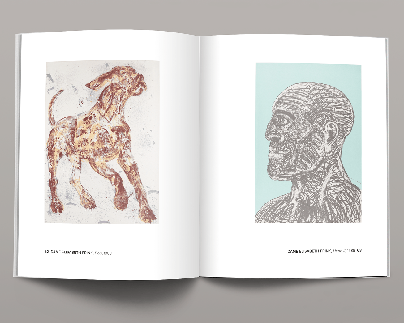
I wanted to make the most of Cambridge University Botanic Gardens' incredible image library, so redesigned their newsletter to enable the use of larger images. I reasoned that even readers who were loyal to the previous design would be won over by the incredible large photos of plants. Adding four pages enabled this, and this combined with a more flexible structure enabled a variety of design solutions on each spread. I wanted to add contrast, so I added a more readable body font – this enabled the text to be slightly smaller too.


